Nobody browses a clinic website. They arrive with a question, look for the answer, and leave the moment they have it or the moment they decide it is not there.
That behaviour is easy to design for, and most practice sites do the opposite. They open with a welcome paragraph, a stock photograph of a stethoscope and a mission statement, and put the four things a patient came for below the fold or on another page.
The questions, roughly in order
- Do you treat what I have? Not your specialties as you would list them to a colleague, but the words a patient would use.
- Where are you, and can I park? A map, an address, and the practical detail about the entrance that everybody local already knows and nobody has written down.
- When are you open, and can I get an appointment? Actual hours, and an answer about availability rather than an invitation to call and find out.
- What will it cost? For private practice, silence here loses more enquiries than any number would.
- Who will I be seeing? A name, a photograph and a sentence about their background does more for confidence than any amount of reassurance in the abstract.
Put the address where a phone can act on it
A patient reading on a phone wants to tap the address and get directions, and tap the number and get a call. An address rendered as an image, or a phone number that is not a link, quietly adds a step to both.
The same goes for opening hours: they should be text, not a picture of a table, because that is also what a search engine reads when it shows your hours in the results.
Answer the cost question in whatever way you can
Not every practice can publish a price list, and some genuinely cannot: it depends on the assessment. That is an answer too, provided you give it.
"Initial consultation from £X, treatment plans quoted after the first visit" tells somebody whether you are in their range. A page that says nothing at all reads as expensive, and the patient goes to the practice that told them.
Write the first-visit page you keep explaining on the phone
Every practice has a set of things it explains to new patients repeatedly: what to bring, how early to arrive, where the entrance is, whether someone can come with them, how long it takes.
Writing that down once removes those calls and reduces the low-level anxiety that makes people cancel. It is also the page most likely to be read all the way through.
Show that the practice is real and current
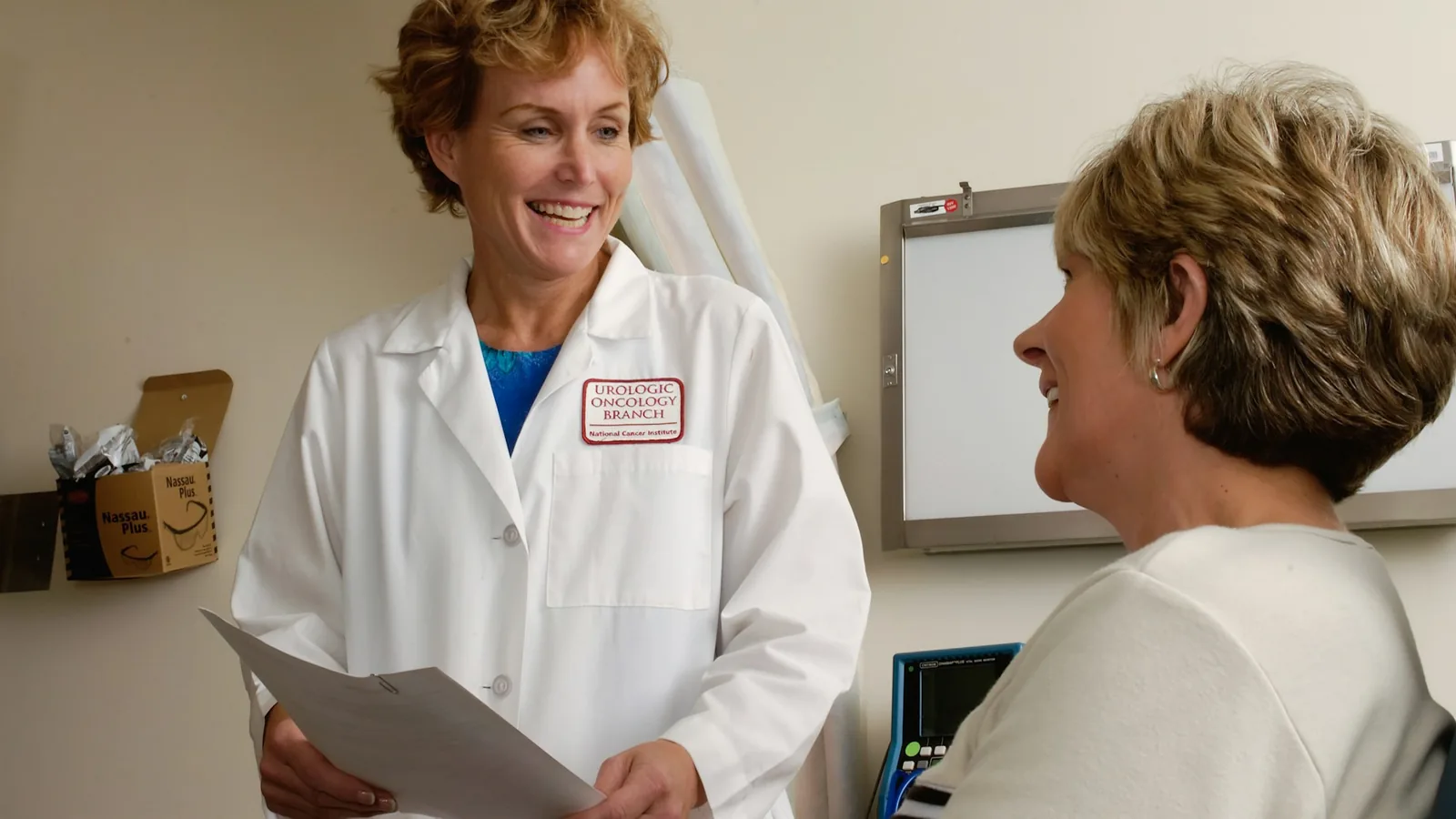
Photographs of the actual premises beat stock imagery, because a patient looking for the entrance recognises the door. A team page with real names does more than a paragraph about values.
Dates matter too: opening hours that were right two Christmases ago make everything else on the page look unreliable. The small business website essentials covers the general version of this, and the medical templates start from a layout that has these sections in it already.
Then make the appointment easy to take
Once somebody has decided, the last thing that should happen is a form that promises a reply within two working days. Offering real times, as covered in online appointment booking for medical practices, is what turns the decision into an appointment.
FAQ
Should a clinic publish prices?
Publish what you can, and explain what you cannot. A range with a clear statement about what changes it is more useful than an empty page, and it filters enquiries you were never going to convert.
Do patients read the team page?
More often than most practices expect, particularly before a first appointment with a new practitioner. It is one of the few pages where a photograph and a short biography do measurable work.
How much clinical detail belongs on the site?
Enough to answer "do you treat this", in the words a patient would search for. Beyond that, detail written for colleagues tends to reassure nobody and confuse people who are already anxious.
Is a stock photograph ever fine?
For an abstract section, sometimes. For the building, the room or the team, no: those are exactly the images a patient checks against reality when they arrive.
What is the most commonly missing page?
Practical first-visit information. Almost every practice explains it several times a week on the phone and almost none of them have written it down.
Read next
- What a medical practice website costs - what it costs to put all of that on a page.