
Responsive

Responsive website builder

One site that fits the screen it lands on, and one place to edit it.

Autumn special offer 3 months free on any plan below, then the normal price. Ends 31 October. Start with the offer - it is applied automatically.
  • Free plan - no time limit
  • No credit card required
  • Cancel anytime
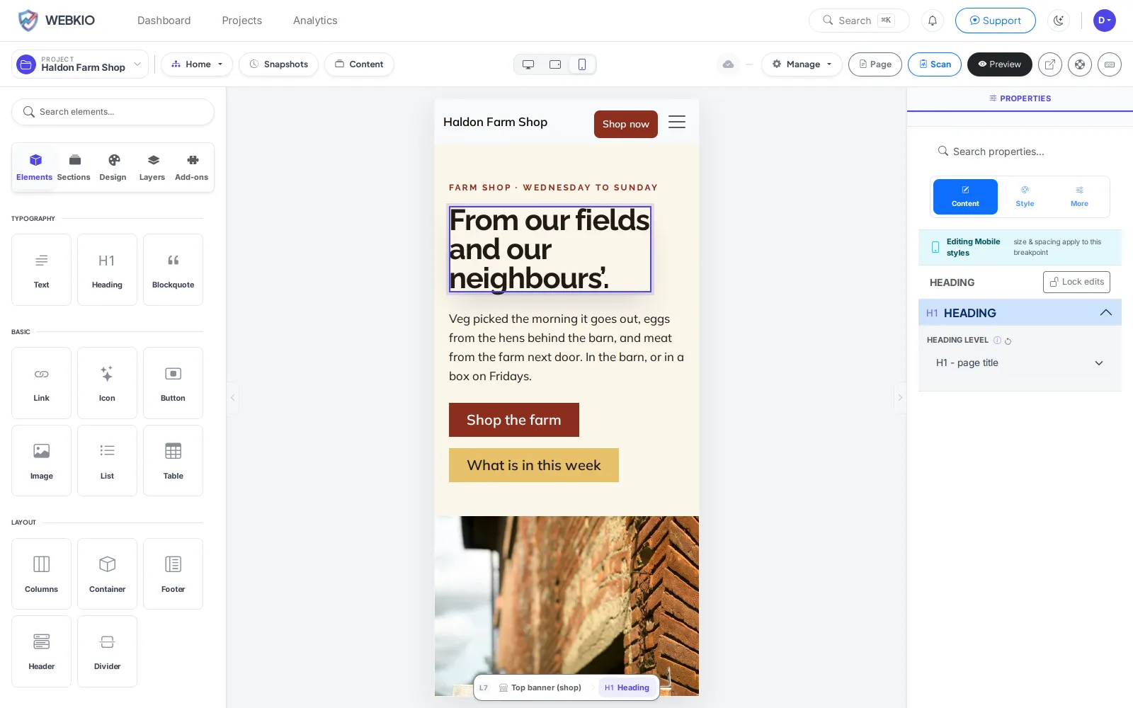
The Webkio editor in phone view, with the panel reading "Editing Mobile styles - size and spacing apply to this breakpoint"

Most of the people who visit a small business website are holding a phone. They are standing outside wondering if you are open, or in bed deciding where to eat on Friday. A site that needs pinching and dragging on that screen loses them, and nobody emails to tell you. Here there is one site, and the phone layout is something you can see and adjust while you build rather than something you discover later.

What it replaces

  • A separate mobile site to keep in step
  • A plugin that makes the desktop site shrink
  • Someone checking the phone view for you
  • Photos straight off a camera, at full size
  • A theme that was responsive in 2016
  • Finding out from a customer that the menu does not open

Edit the phone view directly

Switch breakpoint and the panel says so in as many words: size and spacing now apply to the phone. Text stays shared, so a typo is fixed once and fixed everywhere.

One site, not two

No m-dot version sitting in a corner going stale. A page you add exists everywhere the moment you publish.

Photos that do not punish a phone

Upload the picture straight off your phone. A four-megabyte photo of your shopfront becomes a sixty-kilobyte one before any customer waits for it.

Measured on real phones

Core Web Vitals are collected from the browsers of people actually visiting you, then graded in your dashboard. Every plan, free included.

Tap targets that work

Buttons and menus are built at thumb size from the start.

The way Google looks at you

Google indexes the phone version of your site and ranks you on that. If the desktop site is the good one, you are being judged on the other one.

How it works

Live in an afternoon - no code, no plugins.

1

Build it once

Templates come responsive. You are adjusting, not constructing.

2

Check the phone

One click to the phone view, while you are still editing.

3

Publish

One address, one site, every screen.

Templates to start from

Hand-picked designs for this kind of business - customise any of them.

Frequently asked questions

No, and you should not want to. A second site is a second thing to update and the one people forget. Here the phone layout is a view of the same page.

Size and spacing, yes - switch to the phone view and adjust, and the panel confirms you are editing that breakpoint. Content stays shared on purpose, so a price you change is changed everywhere.

Yes. There is no mobile add-on, because there is no separate mobile site to sell you.

Layouts are built with standard CSS that degrades rather than collapsing. A five-year-old phone gets a plainer version of the same page, not a broken one.

Your analytics show Core Web Vitals measured in your visitors own browsers and graded. If your site is slow on the phones your customers actually hold, it says so.

Ready to build it?

Start free, no credit card. Upgrade only when you're ready to take payments.

Start free

Already have a website? Import it free and see it as a Webkio site, and your pages keep the addresses they already have.