Electronics store website examples
Electronics is bought by comparison. The visitor has three tabs open and a specification in mind, and the site that lets them compare fastest wins. The designs here are built for spec tables, dark product photography and variants that do not turn one phone into twelve products; the real stores listed with them show the result.
4 designs below, and the six things every good electronics store website has. Designs and listed sites read live; the judgement reviewed 8 November 2026.
What a good electronics store website has
The things the examples below have in common, and the reason each one is there.
A spec table, not a paragraph
Screen, storage, battery, ports, weight - as a table the eye can scan and compare across tabs. The paragraph is for what the specs do not say.
Variants that stay one product
Storage and colour as choosers on one page, with stock per combination. Twelve listings for one phone is how search results fill with your own duplicates.
Stock, back-orders and pre-orders stated plainly
In stock, ships in three days, pre-order for the 15th. A date beats a promise, and an honest out-of-stock keeps the trust for the next visit.
Warranty and returns up front
How long, what it covers, who pays the postage. For a purchase this size it is read before the price.
Accessories on the product page
The case, the charger, the cable. Shown with the product rather than in a separate category, because that is when people buy them.
Dark backgrounds, bright products
The designs here use dark palettes because the products photograph best on them. It is a choice, not a trend; swap it if your stock says otherwise.
What goes wrong
- Copying the manufacturer's spec sheet and nothing else, so the page is identical to a thousand others.
- Selling stock you do not hold, then emailing a delay after payment.
- Prices that change daily with no indication, which trains visitors to wait.
4 electronics store website designs to start from
Each one opens as a live preview. The words, photos and colours are yours to change; the working parts stay.
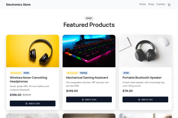
Electronics Store
Electronics shop as a datasheet: a dark still life with a spec sheet of how buying here works, the real seeded products, three rooms to try things in.

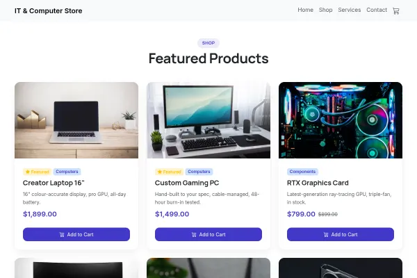
IT & Computer Store
Computer shop on a circuit-board band: a glass-panel tower with a build sheet and total, the real seeded products, build, repair and office support priced per device.
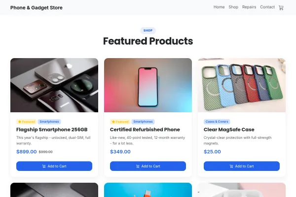
Phone & Gadget Store
Phone shop with a perforated repair ticket of prices beside a cracked screen, the real seeded phones, then repairs, refurbished and trade-ins as three photo panels.
Going deeper
Guides from the blog, and a free tool for the sums.
Frequently asked questions
How do I show specifications so they can be compared?
As a table with the same rows on every product in a category, so a visitor can flick between tabs and find the row they care about in the same place.
How do I sell a phone in three storage sizes and four colours?
As one product with two choosers and a stock count per combination. The guide on specs and variants shows the setup.
Can I take pre-orders?
Yes, with a date on the page and in the confirmation email. A pre-order without a date is a complaint waiting to happen.
Why are these designs dark?
Because electronics photograph well on dark backgrounds. Every colour is yours to change in the theme settings.
Examples for other trades
Start from one of these
Pick a design, add your details, publish. Free to build; pay when the site is earning its keep.
Build your electronics store site - free