Barber shop website examples
A barber shop site is read standing on a sidewalk, by someone deciding whether to walk in or keep going. Three things settle it: what a cut costs, whether there is a wait, and whether the place looks like somewhere they would sit down. The designs below answer all three before the first scroll, and none of them could be mistaken for a salon.
4 designs below, and the six things every good barber shop website has. Designs and listed sites read live; the judgment reviewed November 18, 2026.

What a good barber shop website has
The things the examples below have in common, and the reason each one is there.
The price board, first
Cut, fade, beard, shave, each with its price, on the opening screen. A man who has to hunt for the price of a haircut assumes it is high.
Book a barber by name
Regulars follow a barber, not a shop. Each barber needs their own times, with "first available" for the customer who does not mind.
Walk-ins, yes or no
Say it in one line with the hours: walk-ins welcome until 5, appointments only on Saturday. It is the question asked most at the door.
Photos of cuts you did
A dozen real heads, from the side and the back, taken in your chairs. Stock pictures of models tell a customer nothing about your fades.
Where you are and when you close
Address, a map, today's hours and where to park. Someone on a lunch break decides in the time it takes to read them.
The shop itself
Two pictures of the room: the chairs, the wall, the light. Atmosphere is half of why a customer picks one barber shop over the next.
What goes wrong
- A "services" page written like a salon menu, with treatments and consultations, for a shop that cuts hair.
- Booking that offers any time on the grid, including the forty minutes a skin fade is still in the chair.
- An Instagram feed embedded as the only gallery, which shows last week and nothing about prices or hours.
4 barber shop website designs to start from
Each one opens as a live preview. The words, photos and colors are yours to change; the working parts stay.
Modern Barber Shop
A four-chair barbershop in the dark: the three big prices are the first screen, the board is the menu, walk in or book a barber by name.
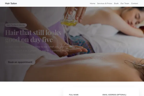
Hair Salon
A three-chair hair salon: every service shows its real minutes as a bar with the from-price at the end, the same stylist every time, the form on the first screen.

Tattoo Studio
A three-chair custom tattoo studio in the dark: every piece drawn first, framed like the stencil it started as, prices and deposit terms on the first screen, a free consultation as the ask.

Luxury Spa & Salon
A small treatment salon: every treatment shows the minutes you talk, the minutes on the bed and the minutes you sit after, with the price beside it and the form on the first screen.
Going deeper
Guides from the blog, and a free tool for the sums.
Frequently asked questions
Does a barber shop need online booking?
A walk-in shop can do without it. Once regulars start asking for a particular barber at a particular time, a calendar per barber saves the phone ringing mid-cut, and the walk-in hours can stay exactly as they are.
What belongs on a barber shop home page?
The prices, the hours, the address and one photograph of the shop. If there is booking, the button. Everything else sits a click away.
Should the prices be on the site?
Always. A barber shop price list is short and public on the wall anyway; leaving it off the site only makes people call to ask.
How many photos does a barber shop site need?
About twelve cuts and two of the room. Refresh four of them each season so a returning visitor sees something new.
Examples for other trades
Start from one of these
Pick a design, add your details, publish. Free to build; pay when the site is earning its keep.
Build your barber shop site - free