Dental website examples
Nobody enjoys choosing a dentist, so the practice that wins is the one whose site makes a first visit feel like a small decision. The designs here show real appointment times instead of a request form, explain what the first visit involves and costs, and put the team's faces where the stock photo usually goes.
4 designs below, and the six things every good dental practice website has. Designs and listed sites read live; the judgment reviewed November 18, 2026.
What a good dental practice website has
The things the examples below have in common, and the reason each one is there.
A Book button that shows real times
A patient picks Tuesday at 3:15 and it is theirs. A form that only requests a visit is a phone call the practice still has to make, usually a day later.
The new-patient visit, explained
The length of the visit, what goes on in the chair, whether X-rays are included, what to bring. The first visit is the one people put off, and detail is what shortens the delay.
Fees, at least as ranges
The exam, a cleaning, one filling, a crown, each with a figure or a from-and-to. Patients compare three practices before they call one.
Insurance and payment in plain words
Which plans you accept, what an out-of-network patient pays, and whether you offer a payment plan. One short section answers the most common first phone call.
The people who will be in the room
Real photos and two lines each for the dentists and hygienists. For an anxious patient this is the page that decides it.
What to do in an emergency
A line at the top: the number to call, when somebody picks up, and where to go when nobody does. Someone with a broken tooth reads nothing else.
What goes wrong
- Before-and-after photos leading the home page, which answers a question most new patients were not asking.
- A list of every procedure in clinical language, with no word on which visit a new patient should book first.
- Three different sets of opening hours: one on the website, one on the map listing, one on the door.
4 dental practice website designs to start from
Each one opens as a live preview. The words, photos and colors are yours to change; the working parts stay.
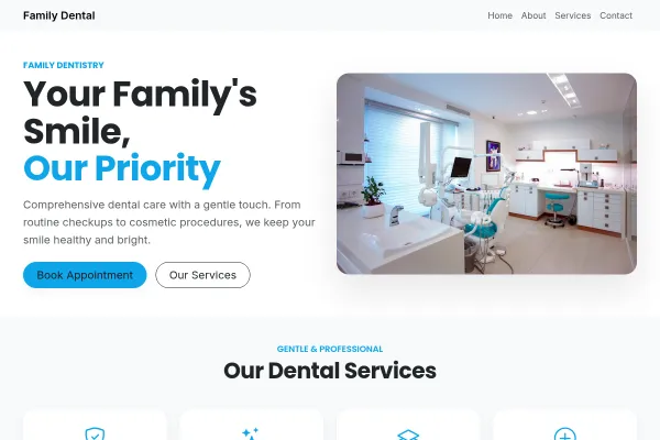
Family Dental
Dental practice in soft mint blocks: booking beside a photograph, every treatment priced, a coral emergency block, a check-up as the ask.

Medical Practice
family practice as a navy ledger: the booking form in a full-height column, appointment types and the doctors' roster in ruled rows, same-day slots at eight.
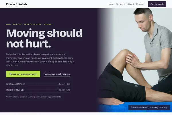
Physio & Rehab
Physio clinic told as the patient's arc: a statement hero, the assess-treat-rebuild steps, conditions answered plainly, every session priced.
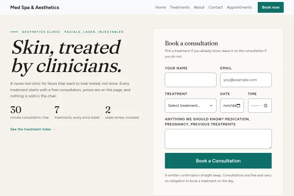
Med Spa & Aesthetics
Nurse-led aesthetics clinic: a priced treatment index with downtime for each, free consultation in the hero, ivory and teal.
Going deeper
Guides from the blog, and a free tool for the sums.
Frequently asked questions
What should a dental website have on its home page?
The Book button, the phone number, the address and opening hours, and one sentence on who you see - families, adults, children, nervous patients. Everything else can sit one click down.
Can patients book with a particular dentist or hygienist?
Yes. Every dentist and hygienist keeps a separate calendar. A patient books a named person or the earliest opening, then receives a confirmation and, later, a reminder.
Do dental websites need online booking?
A practice can run without it, but people tend to look for a dentist after hours, when nobody is answering the phone. Real times on the site let that person book before they have looked at anyone else.
What should a practice budget for its website?
It depends on who builds it and what the booking has to do; our article on dental website costs works through the options with figures.
Examples for other trades
Start from one of these
Pick a design, add your details, publish. Free to build; pay when the site is earning its keep.
Build your dental practice site - free